Tuesday, November 30, 2010

Time to Nut Up or Shut Up!

I've been setting in my line work, trimming the fat so to speak on the sketchy roughs. I can always add more is my theory, but I really need to get the story in place.

The rough for page 4 is also complete. I feel I may have jumped the wall I was hitting with it. I find that when I introduce a key character, I want to do at least one panel of a close up on their face, and that shows some in this page, as well as the first. Looking at the pages, I can already see errors that I will correct for the next version/ post of them.


Tuesday, November 16, 2010

Slow to No Progress

I have made very little progress in the last week in a half. What I have done is start filling in my roughs with the final lines that will be printed, as well as some base colors that I will add highlights and other coloring to. I don't currently have images. I'm also trying to push the 4th page out

Wednesday, November 3, 2010

Torn.. But Not in the Literal Sense


I'm now torn about my second page. I have been trying to push forward and get all the roughs done, but on Tuesday Lily Moore was looking at my work and told me to work on my second page some more. Her concerns were that I had too many panels, the top 3 being able to be combined and the middle section needing clarification on the characters blocking in relation to one another.

I worked up a quick prototype of what I could do on the middle panels. I'll throw the images out there and keep going on my other pages.


Above is the original, to the right is the quickly reworked.

Monday, November 1, 2010

Yet another rough... post?

The third page, and the next is underway. I would have to say though, that the next few pages are a bit less action packed, but hopefully interesting.

The last panel on this page is supposed to be a visual for a teleportation, but I'm not satisfied with the idea. I know I want to show that he is teleporting, but I'm still working out how to best show that.

Well, mid-term in the morning and the book won't review itself.


Wednesday, October 27, 2010

Roughing it; The Sequel


Page 2 is roughed out, and here it is.

Tuesday, October 26, 2010

Roughing it


My first page roughed in. I had the sun panel already done and colored from my first attempt but redid all the other panels.

I set a layer to be a color other than white for the background to make it easier to work on, but I think I kind of like it if I can get roughly the same feel in print.

I am currently working to get all my pages roughed out and then I can come back and refine each panel.


Thursday, October 21, 2010

Getting inside someone else's head

The characters within Coarse Crystal all have a sort of significance with me. Many were created, and detailed out of my own life whether consciously or subconsciously.

First is Zander, the hero of the story if you will. He is not a typical hero in that he is well motivated to be a do good, go getter. He is a young man that seems to constantly be battling himself and a mysterious, inner turmoil. I subconsciously began designing this character in middle school as I was undergoing what I could only describe as the sad or depressing self discovery that can be puberty. Zander was someone that was going through similar issues even if the source was entirely different and the resistance and resilience to these dark and sadden thoughts were inspirational in a way. My problems would be put on this fictional character in a fantastical way and could be worked through, battled, dissected and explained through fantastical means, giving new insight on how to deal with a similar problem realistically. My small moments of clarity through this lead to his small moments clarity. He has become a personified version of my dark emotional challenges and the clarity about myself that they led to his character clarity.

The heroine, Jady, began as an image of what I considered an "ideal" woman. This very, very quickly was changed to include flaws, and quirks to make her much more human and accessible. She has some of the least detail put into her to be honest, but her general nature is very benign, wanting to seek means to help people, and is in the early training to be a healer. She is intelligent while a little naive, charming and easy to talk to but maybe a little intimidating. Jady, I like to think, is a representation on optimization within people because regardless of her name she is rather resistant to jading and pessimistic ideas.

A support character, Exavior, is a creation of my feeling of physical inadequacy in high school. He is a very physically strong, while rather self-conscious and insecure. Exavior is a nerd in every sense of the word, who hatched a plan that worked, to steal a relic of the deity of strength, transforming him into a paragon of physical strength, and giving him a great sense of confidence, that is rather easy to shatter.

While these are not the only characters within the story, they do provide a decent idea of how I go about developing characters.

Tuesday, October 19, 2010

Script Overview

I figured I should give a little overview of what my comic script contains, more than the description that would be on the back of the movie cover.

The story takes place on Earth a few millennia following a catastrophic war that forever altered the planet and the people on it. The war introduced magic into the world as well as many of the races known to the fantasy genre such as elves, dwarves, orcs and many more.

It opens following a thief, who ends up being an antagonist, breaking into what appears to be a run of the mill house. He enters to find the house he thought to be empty still has the residents home. The residents are incapacitated and the thief flees.

Meanwhile the hero and heroine, Zander and Jady, head home from a day out to Jady's home which has been broken into and her parents incapacitated.

This is the point that I am aiming to get to in the comic

Tuesday, October 12, 2010

Continued Proposal

Typography:
I suppose that the typography I have had in my head for this comic project is what I would consider 'standard Marvel lettering'. It is all capitol letters, bolding and italizing for emphasis.

More Gutters and Book Dimensions:
I am hoping to do my comic on standard 8.5" x 11" much like my standard Dungeon's and Dragons books. I think it is a comfortable size for me to work in, and gives me some room for play. The margins will be 3/4" on the inside/ binding side and 1/4" on the other three sides.

Other Continued:
Another character sketched out. Exavior, a support character.


I was also inspired to work predominantly on the computer after seeing a classmate last year post a link to daarken, a concept artist that has a youtube channel showing how he goes about doing his digital paintings.

For now, I will continue to take the story for my comic and break it into a loose script and block out panels.

The Proposal

The Story Proposal:

In a post-apocalyptic high-fantasy Earth, our anti-hero, Zander and the damsel in distress heroine, Jady, have their lives changed dramatically when they find themselves the center of a disastrous plan of world domination. Zander and Jady, with the help of many friends along the way, face many challenges and foes in this mysterious and action packed drama.

I have a few character sketches of the hero and heroine:

I have not thought about typography, but would love to play with gutters, wider gutters to give the impression of longer time passing, and thinner gutters for shorter time passing. I'm looking into small margins, and no bleeds unless it is conducive to expressing a specific action or sequence.

Monday, October 11, 2010

Visual Influence


One of my visual inspirations is Marvel's Young Avengers. This may be because it is the only comic series I have read, but I think it is the high contrast shading and great use of line. The imagery in the Young Avengers is rather tight, with great composition in terms of size, relation and silhouette.

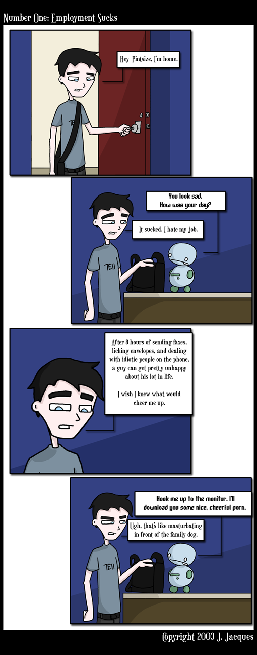
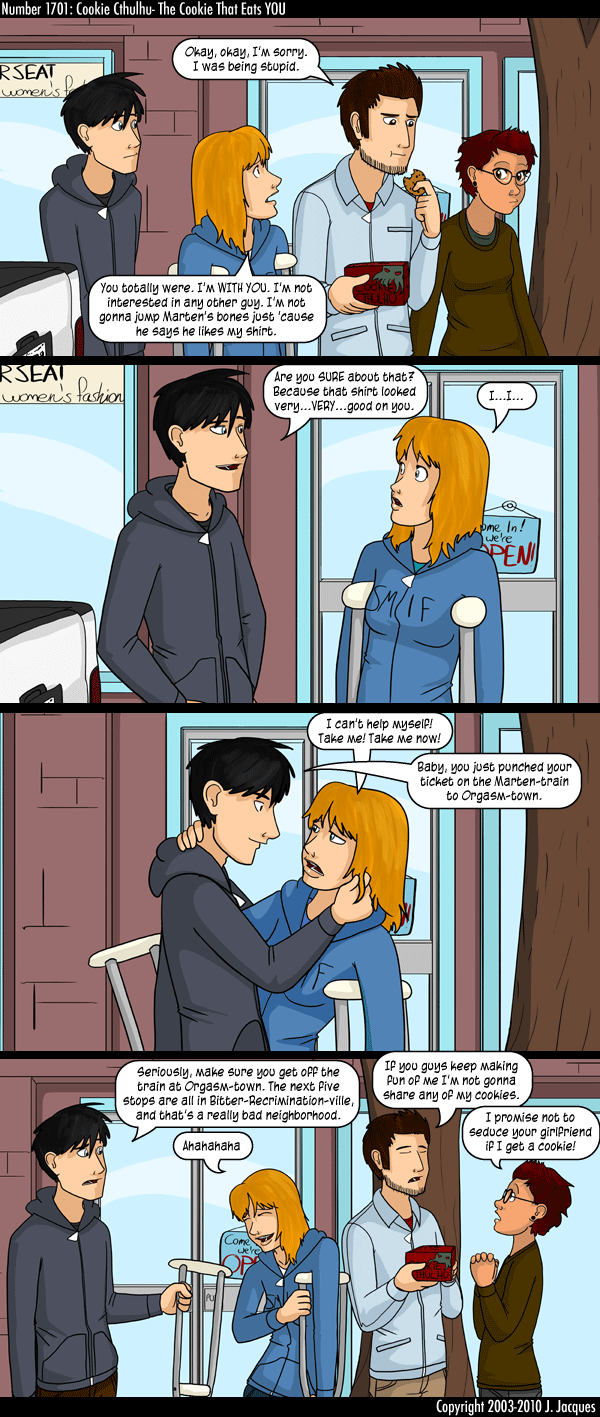
My other visual inspiration is a little less formal of a title; Questionable Content, a web comic with very simple detail, minimal line work and irregular gutters. It has also been fun to see how the artist has grown in talent, expanding his style from:

To:

I will have a proposal for my comic up shortly after this post

Thursday, October 7, 2010

Small Changes

I am currently trying to bring all my work into the computer. I have already changed the first 2 panels to better fit Miles' explanation of how to stronger tell the story.


It opens on the sun in the sky, the second panel still viewing the house, but this is where the talking happens so the writing goes left to right, shows the 3 men outside this home, and provides a sense of mystery hopefully, as they are being introduced from behind as silhouettes.


Inspiration

I draw inspiration from all sorts of sources, and for designing my comic book I have decided I would like to use a story I have been working on for a handful of years. I drew inspiration for it initially from Final Fantasy IX, designing some characters in similar style. Over the years the story has evolved to envelop many more inspirations such as the shows Buffy the Vampire Slayer, Angel, Supernatural, Charmed, as well as movies such The Lord of the Rings Trilogy, 300, even Narnia. As you can tell, my story could very easily be classified as high fantasy, containing orcs, goblins, elves, dwarves and many more magical aspects. I also check Games Workshop: What's New Today blog daily.

My initial page I would like to have throwing the reader into a story that has already started. There are things in motion that have started before the story itself starts, and the first page is showing it beginning to surface. The reader should find themself asking not what is happening, but why is it happening.

My working title is Coarse Crystal.

Tuesday, March 9, 2010

Last Update for the Final

My Character before poly smoothing, and after.


I didn't get to UV map it as I couldn't find the time. I completed the model itself in class time and staying after class a while each night. One more class period or week and I would have had him finished completely.

I enjoyed making it, but struggled to keep the poly count down, so even in the low poly version he is just over 4,000 poly's.

Monday, March 1, 2010

Up to the Updates!

I noticed that a fresh face in the game design industry is hiring for multiple positions and thought others may be interested in Riot Games.

http://www.leagueoflegends.com/board/showthread.php?t=66803


Other than that, just trucking on the character model. No pictures currently, but I should have some in the next few days.


Tuesday, February 23, 2010

Forgot to Post

I forgot to post this last week, but I got my keep textured, at least on the outside. Also got my character roughed out and getting it ready to bring in to model.

Thursday, February 11, 2010

Work Work

My Work in Progress shots.My Throne room is nearly completely modeled, just need a few tapestries. I'm ready to start texturing.


The exterior is coming along as well. I got the snow down and some of the lighting to get the right mood, but now I have to finish some of the deconstruction (ruins) of the keep before I texture. This weekend will be rather full of computer lab tanning.

Tuesday, February 2, 2010

COnstruction Underway

I am working on both the outside scene for a few nice camera stills and the interior of a few rooms. I am finding that the hardest part is still getting the commands right. I am taking another 3D class currently that uses Blender, and open source 3D tool and the tool shortcuts are just different enough that I mix them up periodically.

Thursday, January 28, 2010

Pre-Production


1. The place I chose is a rather ruined, personal keep of a necromancer. It is supposed to be kind of post apocalyptic fantasy, in an undetermined year. This keep was built in the frozen tundra, rather desolate surroundings and very cold. There would be the lingering scent of frozen death, potentially a few frozen skeletons or corpses laying about in the undisturbed snow.

I want the keep to have old and worn graves scattered around it as well as a broken, iron fence.


2. When thinking up the castle I realized that I was drawing on the old English castles and adding both a bit of a Disney twist (think Beauty and the Beast) and a dash of the Asian/ Eastern palace style.

My use of plants will be extremely limited, sticking to just some static grass that may be poking through the snow and maybe a small dead snag of a tree. I could include dead vines if I feel that the scene is truly missing something in color or line.  

I'll have to figure out and include a fair amount of stone and/or brick textures as well as some textures to try to capture the feel of the snow. 


The pictures attached are some rough concepts of the exterior scene and some of the interior.


Tuesday, January 26, 2010

Ready to model the next project.


I have found some images to help me do up my concept sketches and get this next project underway.

I am going for a frozen keep in the tundra. These images should help me in narrowing my pallet as well as being good reference for forms.

Lighting should be interesting with the use of snow, or planned use of snow at least.

**Amendment: I misread the original assignment post and will design the interior of the keep. It has only a few chambers, and they are supposed to feel rather desolate, so I shouldn't be jumping in too deep. I'll figure out some cloth for draperies and rugs, texture the walls in an old, beaten stone, and add various small odds and ends to fill it out, such as the throne in the throne room.

Thursday, January 21, 2010

Mesh, UV, and Lights!


I know that I was supposed to be doing UV's and textureing, but I got into the lights too. I textured a cube into a dice and a donut into a ring. Just playing with it to get a sense of what I am doing.

Tuesday, January 19, 2010

Thursday, January 14, 2010

Sneak Peek


Here is a sneak peek at one of my camera angles. The rest will be posted by Tuesday.

Tuesday, January 12, 2010

Work In Progress 1/ 12

My work in progress shot from today. I am going for a city in a bubble look, and I feel like I am getting a decent sense of scale. Hiding amongst the buildings are actually vehicles that I modeled to help show the scale, but zoomed out they are nearly impossible to see.

-Cory

Resources

For my city I have been trying to draw on some of the more technological Final Fantasy type cities such as this one;


That seems to be the only good image of the cityscapes I am drawing on.

Thursday, January 7, 2010

City Scape

My Work in Progress for today.
I'm going for a rather space age feel. I was looking through the conceptart.org stuff and was finding stuff that I was going to draw on for how they used their geometric shapes and hard lines. I did not however pull any of the images to post.

-Cory